One Family’s Journey from Rubble to Renaissance
A family’s heritage is preserved in a unique way using sustainable products with the help of Interior Designer Jennifer Moreau from Moreau Designs.
Were you passed down something in the family once and you clearly can’t see a use for it as it doesn’t seem to fit the style in your home? Take a step back and look at it differently and I’m sure you will find a different use for it, maybe in a different form. For one of my clients receiving a farm estate meant inheriting all the furniture and everything on the property. Seeing a picture of a rubble of wood laying on the grounds sent from the homeowners, exclaiming ‘let’s use this!’, I have to say was a little uninspiring at first, until the woodworker milled down a piece. Through all the grit and grime there was a true gem and it only got better as we treated it with stain and polyurethane. Piece by piece it became a masterpiece that now proudly sits in 3 distinct places in the couples “new old digs”.
looking at things with a different perspective breathed new life and renewed joy into this home
We not only honored the family and their business but managed to add some personality to an otherwise neutral space multiple times. We started out designing a bar that would serve as a central meeting place for business and family in what was the former living room, now turned dining room area.
Rendering for bar design by Moreau Designs
In Progress, what an exciting thing to see, all the hard work from everyone coming to fruition!
Up close, this bar is the clear stand out in entertainment for this family.
We snuck in a pub table last minute with some leftover wood.
Custom window treatments, Moreau Designs
Design by Moreau Designs
The herringbone pattern was a very intentional layout to create texture, interest and most importantly elevate the feeling from simple barn wood to something more sophisticated. This took some work, a lot of skilled labor, tons of revisions to the design so every detail was thought out and executed. As you see, the final rendering presented to the clients, once approved, took a couple months to realize this, and right in time for Thanksgiving.
Using more of the wood, we created some shelving as a pass through in the sunroom areas existing windows. These windows were left in place when the previous occupants had put on the addition of the sunroom and left them, no longer functioning, they were removed and in their place a beautiful custom shelf with family objects were artfully arranged.
Custom design by Moreau Designs
That wasn’t it for this chestnut wood, we also crafted a clever built in area for linens and serviceware. The wallpaper was William Morris’s Strawberry Thief and came to find out after we specified it, that the Mother also had used it previously. You can call it kismet or serendipity. Once again arranging objects that were important to the family meant my team and I painstakingly sorted through and grouped them in prominent areas.
An old family cookbook and pewter displayed on the built in designed by Moreau Designs
The wood wasn’t the only piece that was graciously upcycled, the couple also was gifted a sofa that was in great shape that they wanted to keep but didn’t care for the upholstery. So we sent it out to be reupholstered and it really created a modern vibe when we detached the former skirt and added piping. Blending the old with the new was something that had its challenges, but was welcomed by my team and I, and in the end created this new feeling throughout the spaces.
How it started, definitely was not what the clients wanted, so we made modifications and it turned out beautifully. (see below)
We were able to make it more modern by adding the piping and taking the skirt off.
One non negotiable was to change the color of the walls and the window treatments. Design by Moreau Designs
The key takeaway is to realize the value in objects for their raw and unique qualities. Sometimes all it takes is a new perspective and creativity to make something into an “old new” object. Here are a few ideas for you to implement in your own home:
Wood is a very versatile medium and you can create a multitude of things, frames, coffee tabletops, side tables, lazy susans for tables, trays, decorative boxes, the list goes on and on.
Maybe you have some books, you can frame pages (if they are tattered and worn), if you have enough you could make a headboard out of the covers, you could also cover the top of a table and laquer them to protect them, you can stack them and make them into a lamp.
Lace and embroidery can be framed, sewn together to create a runner, they can be sewn into the center of a duvet cover, pillow cover and window treatments.
Crystal bowls and compotes can be made into candle holders, there are many kits that allow you to melt wax and include wicks, it would be very cool to have a grouping of them, you could also use them as soap dishes in the bathroom,
Family dishes and service ware can be displayed differently as well, most are put into a china cupboard. A more casual approach is to stack them on an open buffett. Maybe you have some chipped and cracked china and still would like to keep them? You can repair them with kintsugi, the Japanese practice of repairing the cracks with gold dust. You could also make a mosaic tray out of the pieces or a frame.
Honoring all that has been passed down doesn’t have to translate into preserving the exact object, the point is that we realize to fit it into our lifestyles and aesthetics it may have to transform into a totally new piece and that in itself is a beautiful way to pay homage to our heritage.
Drop a line and let me know how you create the Art and Soul of Your Home,
XoXo Jennifer
Do you want to be inspired to create a rustic yet refined home bar?
Click on this shoppable link to get the look!
Creating a Soulful Environment in your Home
Biophilic principles are the key to a foundation of a calm and inviting environment. Here are some ways you can create them in your own home.
“Have nothing in your house that you do not know to be useful or believe to be beautiful.” ~William Morris
Moreau Designs created this space at the Designer Showhouse for Junior League of Hartford . It’s a good example of a nourishing and calming space that you can create in your home. Photography: Sandy Lisella
Creating a connection in your home with living spaces that nourish your sense of well being is within reach. We live in a day and age of constant on the go attitudes and busy is the new normal. What happens when we slow down? Or do you slow down? How does this relate to your home environment? I’m going to give you some ideas to incorporate key elements to reduce stress and allow you to relax fully in your home.
Artisan made pottery by Vicente Garcia Studios sits atop a custom designed bench top by Tiger Lily Furniture and a base fabricated by Shelby Barnhardt Studios
So what are the key elements?
The use of Living and natural things~This is an easy one,understanding the concept that plants do cleanse our air as well as give us a sense of fresh beginnings and beauty. It is also a movement that is trending right now, called Biophilic Design, which is the practice of bringing natural elements inside. It includes not only plants, but wood, stone and water. You may notice this trend in commercial spaces, but lately I have several requests for use in private residences.
Soothing Colors and bridging elements ~ I cannot stress enough the importance of the pyschology of color…It will make the space more calming when you also pair what is outside the window with a color that compliments or is in direct relation. I used blue that not only ties in with the wallpaper, but it is a reflection of the water outside the sun room windows. Elements that you can bring indoors like this indirect nod to the birds that inhabit this property, by using the wallpaper, on the ceiling-birds in flight and on the wall peacock plumes helps ground the space and create that connection.
Texture/softness ~ It is soothing for the eye to have these elements in a space as your eye doesn’t settle on one particular thing. Texture also encompasses the sense of touch. The sisal rug, linen panels and color palette that is harmonious are valuable in a space that is great for decompressing.
Light ~Natural diffused light is the best, but when you can’t have that you can mimic it with artificial lighting. Many lighting companies have bulbs that can create a natural looking light.
Open and clean spaces ~ Clutter is definitely a distraction and having spaces that you edit relentlessly is really allowing you to think and function properly.
Unplug the world ~No phones, computers, radios etc. Probably the hardest thing to do is put down that phone, but it gives you a moment to recharge.
Scent ~ the power of a beautiful fragrance, it can be a great way to relax. Whether it’s a candle, incense or diffused oil you can create this all important layer for the senses.
This living wall was created in the showhouse by using succulents. I wanted to create a natural flow by predetermining the design on a piece of tracing paper that was then set underneath for the horticulturist , Nancy Butler to mimic the curve. Wallpaper: Relativity Textiles
A great example of incorporating natural elements with this pottery and air plants/moss. Notice the water like pattern and coloration of pottery. I also like that there is a very natural element of wabi sabi with the stitching of the cracked pottery.
Looking outside these windows, this spectacular view of the pond is brought inside with the color and shapes incorporated in this space. The bench serves two purposes, for display of plants and a quick meditation area by adding pillows underneath.
Whether you have a full room or a dedicated corner in your home for unwinding, it can prove to be helpful in overall health and productivity in your life. I would love to answer any questions you have in the comments below!
Blessings,
Jennifer
How to Create a Sophisticated Halloween Party
Do you feel like the only option you have for a Halloween party are pumpkins, bats and witches? I'm here to show you how you can create something that is much more sophisticated and just as fun for your party!
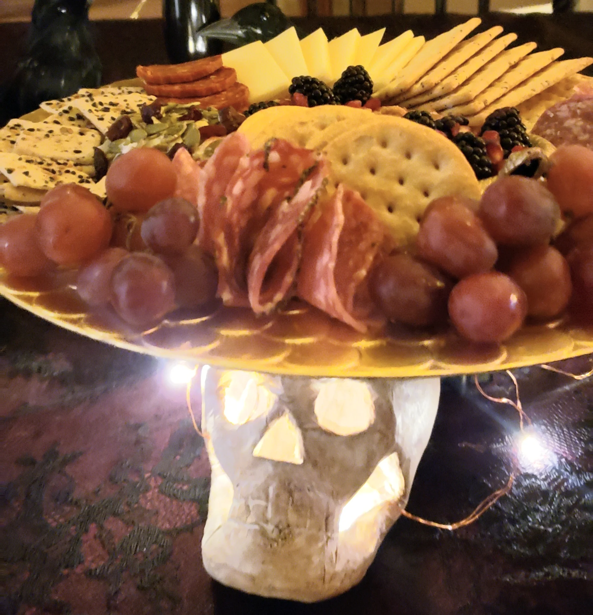
Here I used skulls that came unfinished and painted them with white and brown paint rub. I've used them as risers for the charcuterie tray with some battery operated lights underneath for that special glow. I couldn't resist placing a rose in the mouth area..olé!
I love keeping my parties casual, so I can enjoy them as well. Appetizers, drinks and desserts are just right for this type of gathering served buffett style.
Signature drink: Chambord over ice, blackberry gingerale and blackberries on a stick stirrer.
I hand out drinks as soon as you enter the party area. It helps to loosen up your guests and creates a conversation starter. I also like to keep the drinks separate from the main buffett. This creates better flow and doesn't saddle your guests with holding everything at once.
Something fun to add to your ice bucket (not to be consumed) are these ice cubes with plastic spiders that I froze days in advance.
It's equally as important to create an atmosphere with your decorations as is the quality of the food. I use a variety of creepy things, like snakes that I glammed up by spray painting gold.
I've used them in unexpected places, in my vase with my flower and on my food trays. I used a snake on my cheese and charcuterie tray as a template for placing my food. Just enough creep factor!
Super creepy to use them in the skulls and even added glow sticks.. would be amazing at night.
My favorite decoration though, was the crow sitting on top of the candelabra. I used gold raffia to create a nest and battery operated lights askew add the extra creep factor.
Just look at him perched there..not even giving a flying fig about anything. #currentstateofmind
I made basic cupcakes with a combination of white and chocolate frosting with black food dye, it makes an interesting and creepy effect. Top with edible gold leaf and a skull made with a mold of cream cheese and sugar and voila, creepy meets sophisticated!
The coup de gras of this whole set up was the addition of dry ice. You can find it at some local grocery stores, or like I did at Airgas, which is a common business all over the United States. Sold in pellets or blocks, you have to bring a cooler and make sure you vent the lid. There will be sublimating going on…a fancy word for off gassing. Also, make sure you crack a window in your car for the C02 to escape. Using hot water works the best, do not touch this ice with bare hands, it will burn you at -135 degrees. I used some cheesecloth and pellets that I tied off with raffia, it made it so easy to drop into the water. The other thing to consider is using a very durable vessel, I used thermal stainless steel cups and they kept the water hot and were durable enough to handle the sudden temperature change.
I put the cup in the ice bucket, cue creep factor. To see this in action head over to my press page for a video of the segment I recently did with NBC30 CTLive
Happy Haunting on Halloween!! Hope it’s as creepy and sophisticated as it gets!! I would love to see your Halloween creations and comments below!!
Xo xo,
Jenn
How Remodeling your Kitchen can be like Pairing Fine Wines with Food
A kitchen remodel can be your costliest remodel in your home. Why leave it up to chance to create a cohesive design and plan for your kitchen? Knowing the perfect pairing for your kitchen remodel will save you undue stress and time.
A kitchen remodel can be your costliest remodel in your home. Why leave it up to chance to create a cohesive design and plan for your kitchen? Knowing the perfect pairing for your kitchen remodel will save you undue stress and time.
First thing to consider: what is the overall feel of your space? It could translate into color and tones, a specific style, or a time period, ( which is appropriate for older historic homes.)
Being careful not to incorporate trends on fixed surfaces will ensure that your kitchen won't look dated. Fixed surfaces include: countertops, cabinets, backsplashes and flooring. You're saying wait Jennifer, that's everything, right? ..no it isn't because easily changed things like stools, lighting, hardware, and window treatments are the remainder that can bear trends.
I was fortunate enough recently to attend the KBIS (Kitchen and Bath Industry Show) in Las Vegas with designhounds as an Influencer. There I got to see trends and new introductions. See my previous blog post about 5 trends for kitchens and baths for 2019. I was also invited by one of our sponsors, Caeserstone to the New American Home located in Henderson.
DesignHound’s Pack assemble!! Photo by: Jeffery A. Davis Photography I’m on the far right…the redhead with a sass factor of 10+
Here is our fabulous group Designhounds at the home (minus a few). Can I say spectacular? Views of the city of Las Vegas, infinity pool, a home that opened up completely to the desert patio. A cool surprise was the models that they painted to represent their finishes.
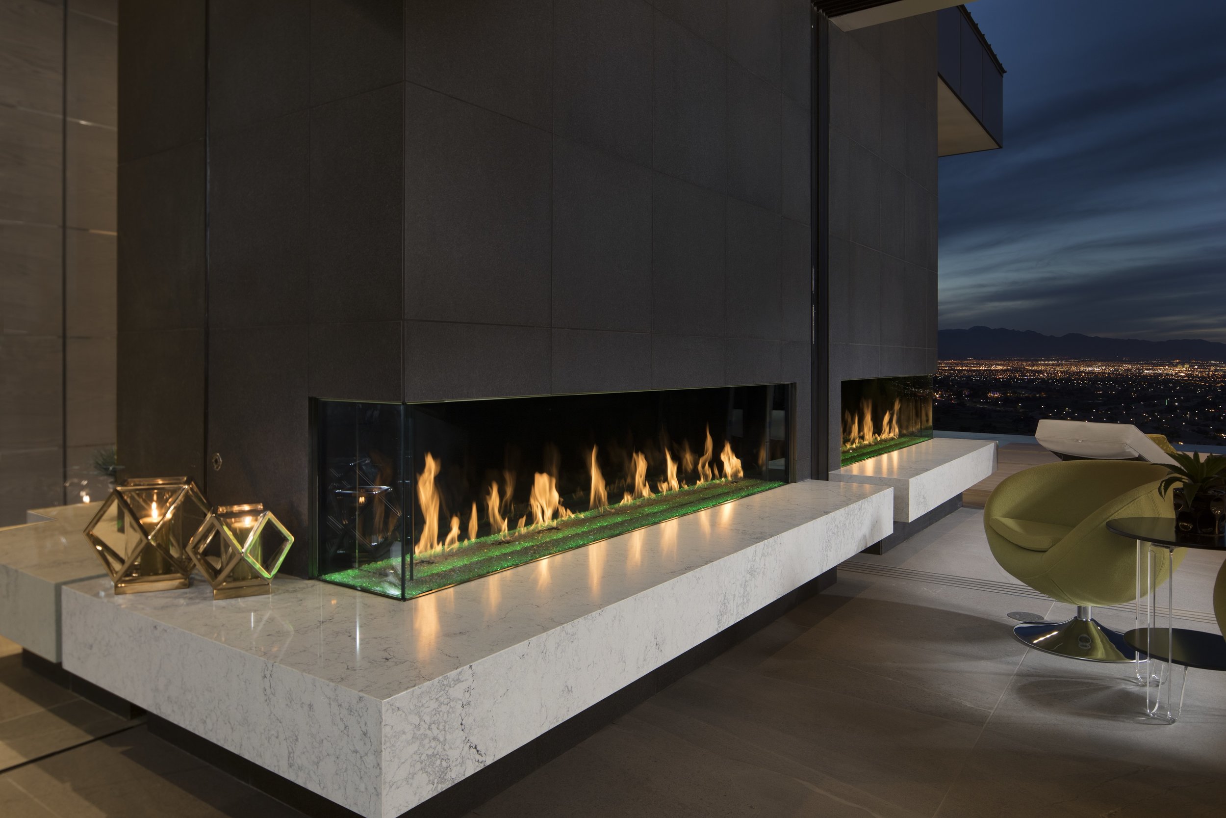
I literally had a freak out moment when she opened her eyes!! This is Caeserstone’s Noble grey on top of the fireplace and Vanilla Noir for the hearth, which seamlessly runs outside on the patio.
The fireplace extended outside along with many of the countertops and bars. Photo: Jeffrey A. Davis Photography
Ok, now we are over the shock and amazement. Here’s a case study. Let’s look how the perfect pairing can work with appliances and countertop finishes…. another sponsor, Thermador , had appliances in The New American Home by Caeserstone. It totally makes sense in this scenario as the kitchen as a whole was very streamlined. The refrigerator, oven range and hood all go with this style of kitchen. Notice the clean lines that are repeated in the countertop from the appliances.
The New American Home in Henderson Nevada by Caeserstone, photos by: Jeffrey A. Davis Photography
Like Sonny and Cher, Peanut Butter and Jelly, they just work together. The new finishes are reminiscent of nature, stone and concrete, and paired with the appliances they share similar attributes. In the above photo, Caeserstone has installed the Montblanc countertop in a waterfall edge and it looks very sophisticated and modern. Notice the different countertop materials being used throughout this home, it still creates a cohesive look, because the tones and style are close in nature. Thermador Home has some spectacular offerings for some nice looking wall ovens, ranges and hoods that pair nicely with this aesthetic.
Thermador’s professional collection offers: steam, speed and convection in one!!
The cabinetry and appliances are on the same plane and therefore look like a seamless design. The appliances are still visible, but they don’t look so stand alone. This makes it very appealing for modern interiors. We are getting away from the traditional idea of the kitchen as a very utilitarian space and it is now part of the design of the home. Like you see below, the Thermador wine refrigerator fits in nicely in this cabinet.
Thermador’s wine columns are home connect enabled. They can be controlled remotely and can even give you the perfect wine pairing…how’s that for smart??
This is just one example of a beautiful pairing. Both Caeserstone and Thermador Home offer different lines that work together for any style. You can easily take these countertop finishes and appliances and pair them with a traditional kitchen. The cabinetry in this case would be more of a decorative element. Thinking about all your elements in your kitchen this way creates that cohesive look throughout your space. This home is a perfect example of attention to detail and pairings that work. Speaking of pairings, my Pinot Noir is calling my name…and it’s not going to drink itself.
Cheers!!,
Jennifer
Closet Envy is Real
I’m writing this in severe envy…..I just got back from Kitchen and Bath Industry Show and realized my closet isn’t cutting it.
I’m writing this in severe envy…..I just got back from The Kitchen and Bath Industry Show in Vegas and realized my closet isn’t cutting it. One of the vignettes at Wellborn Cabinets booth had me at first sight.
Do you think they would notice if I took up residence here? I mean this closet may have very well been my bedroom.
Do you see that ‘lit ‘ closet? Cue the musical, Annie’s song: “ I really think I’m going to like it here! “ The details, mirrors…circles, studs, the way the doors opened. I can’t decide what I like more? The fact that it doesn’t look like cabinetry but more like a built in or that they kinda got the whole luxury feel.
ahem…this is where all that fabulous jewelry will reside. I mean with a closet like this…that is a given.
This was so well executed that I started having a vision what my dream closet would look like? This is close, but I would add a little more bling. Enter Lampsplus, they not only have lighting, but also accessories and furniture. I’ve created a board that if Wellborn Cabinets and Lampsplus had a baby this is the result…isn’t it darling?
I would have to have some kind of seating like this wingback chair from Lampsplsus. I mean who wouldn’t want to stare at this most of the day or when the kids are screaming and you need a mommy break. Door lock: check, chocolate: check, wine: double check, no really you don’t want to forget this….you get the picture. A MOM CAVE.
Lampsplus has so many unique pieces of lighting, the chandelier was a new introduction this show. I would hang 2 or 3 of these over the jewelry and accessory island….the bigger the island, the better. Ok, so I have to admit…if I’m going to all the trouble of tricking out this Mom cave, it needs one more thing:
A bar cart of course. It would just look pretty in the corner with these martini glasses. Purely decoration for the soul.
Thanks Lampsplus and Wellborn for allowing a girl to dream!!! A special thanks to Designhounds, and Veronika Eagleson from Modenus for exposing us to some great sponsors/vendors!! Now back to reality…my life is glamorous, my life is glamorous…. Hope you find yourself dreaming and planning a wonderful closet like this in your near future!!! Fairy God Mother where are you???
Blessings,
Fairy Jennifer
How to Create a Rejuvenating Environment in Your Bathroom
Bathrooms are no longer utilitarian in nature. They have deep purposes in our crazy world. You can create a better environment by following these rules in your next renovation:
Bathrooms are no longer utilitarian in nature. They have deep purposes in our crazy world. You can create a better and healthful environment by incorporating some of these products into your bathroom:
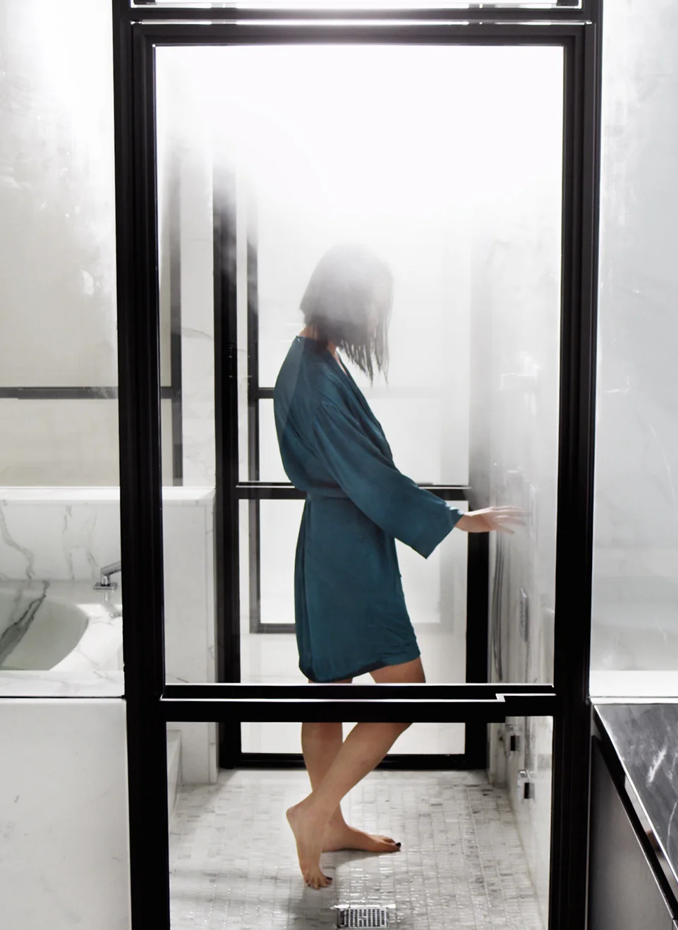
Steam is not only an environment maker it has health benefits. The company, Mr. Steam has some excellent steam shower units. They help with sore achy muscles, allergies, clearer skin and relaxation to name a few. Another feature that has been introduced is an aromatherapy feature. It is piped into the system and works on a timer or on demand. I sat in on an a really amazing presentation on this product line with the Vice President of Marketing, Martha Orellana .
Martha, Martha, Martha, her enthusiasm and infectious smile and laugh have you believing that the good life is when you have a steam shower in your life. True to the company, she does indeed have a steam shower or two…pictured in the middle with her team!!!
Another good thing going about their units is that you can plan it online and it's no extra set up with the plumber, the generator unit depends on the size of the shower and it needs to be 60’ from the actual shower in a heated space with 12” around for venting.
Check out their video, it really makes you want to relax, doesn’t it?
Below you can see a before and after with the steam system. The unit is streamlined and good looking. To enjoy the full experience, taking the enclosure to the ceiling is beneficial. You can include a vent, but it is not needed. They also recommend no more than a ceiling height of 8’.
Before on left…after on right. Not much of a difference, except the benefits of this steam shower set up will be phenomenal.
Now we are heating up!! Another thing to consider are your finishes in your bathroom. I hear so many good things about copper and this bathtub from Thompson Traders is no exception. Not only is very stylish and sleek, but it helps with your skin!! It helps produce collagen, it is also said to be anti inflammatory. Double Whammy!!! I fell in love with this product line and family behind their products.
Hello gorgeous!! Want to go for a soak? I feel the need to bathe in this midday with champagne and long gloves…are you feeling it?
All of their products are artisan made in Mexico Like this beautiful sink seen below.
Another good thing to incorporate into your space are live elements. Things that help purify the air like plants. They circulate oxygen, look pretty and reduce airborne dust levels. Each plant has different properties. The peace lily actually removes mold from the air. They have done so many studies on this subject. I encourage you to look at this article for some great information on this subject: Importance of Plants in your Home
Lighting and chromatherapy are very important in creating an environment as well. Chromatherapy is the use of colors to promote relaxation. It is a powerful way to achieve balance and harmony through it’s vibrations. It can calm or energize you. Lighting really helps create a mood or environment in general. Having your system on dimmers are a great way to relax and unwind. Mr. Steam also uses chromatherapy in some of their products.
Mr. Steam here again…chromatherapy is the real deal. Go in normal, come out a wizard!!! Huzzah.
Are you ready to create an environment? These simple suggestions will take your everyday bathroom and transform it. The senses are key here and when you realize the benefits you’ll want to treat yourself!!
Blessings,
Jennifer
5 Kitchen and Bath Trends, Straight From KBIS
I literally just recovered from jet lag after attending KBIS in Las Vegas. For those of you that aren’t familiar with it, It’s the Kitchen and Bath Industry Show that takes place annually. I was told 100,000 people attended and I believe it!! I was there on tour with a lovely group of Design influencers and bloggers as part of the Designhounds KBIS tour.
So many things that I noticed on tour about the status of trends in Kitchens and Baths, here’s my take on 5 trends:
1) COLORFUL appliances, sinks and faucets. If you’re afraid of color, don’t apply. I mean every turn I took there was a bevy of interesting hues. Mainly primary colors. How to apply….not liberally like sunscreen…I would say sprinkles here and there.
My husband would totally let me do a hot pink faucet….(insert scared emoji here)
Lemon with your lemon?
2) Smart home capabilities: Think George Jetson…the future is here baby! And on top of that, a couple of new introductions that had me giddy. One being a closet that you put your clothes, blankets, stuffed animals…dog…ok, maybe not your dog, in to refresh. You can put your dry cleaning in as well. Think of the possibilities!! Carry that over into the kitchen as well with apps and the capability to program anything, anytime….Big brother are you there?
Beep, boop, beep…the future is here!
Carnival stuffed animals delight!! NO excuse to throw those out MOM. Courtesy of LG
3) Creating Environments: Showers aren’t showers anymore, they are full scale environments, capable to give you a rainforest experience rich with chroma therapy as well as music and scents. Who needs vacation?…..ummmm..me..over here. More on this in a separate blog post about the health benefits of something like this with a very cool featured product.
I just really want to know what a ‘night’ routine is????
4) Invisible appliances: I think the weirdest, most exciting thing I spotted was an induction cooktop underneath the countertop!! Now that is magic and no matter what you say, I think it’s pretty genius! This is fairly new and found a couple vendors who were offering it….I think it needs to develop and I’m pretty sure there will be more intros next year.
5) Push release cabinetry: On everything including appliances and cabinetry. Hardware need not apply.
So there you have it, 5 trends from this year’s show. Come back around to see some in depth blog posts about products that I’m featuring, including appliances, cabinets, countertops and steam showers.
Go cook something good up today!,
Jennifer
Romantic Crepe Paper Flowers
DIY Romantic Crepe Paper Flowers — Only Ten Steps!
Check out the quick tutorial video to get started!
Materials Needed:
Crepe Paper - I used Lia Griffith’s doubled sided paper, to add extra depth to the flowers. The ombré of pink made these look all the more realistic!
Pencil
Eraser - Because let’s face it, mistakes will be made
Scissors
Black Crepe Paper - I used a roll of streamers for this part, but really as long as you can create long strips anything goes!
Old Paintbrush - It will be used with glue
Mod Podge - or other wet glue would be fine
Styrofoam Balls - about the size of a quarter
Printer Paper - this is for making your stencils
Step One
Gather these materials to start creating the pistil of the flower
Step Two
Cover a ball in black crepe paper lightly dabbing the glue both below, and on top of the paper. Dabbing helps prevent it from tearing.
Step Three
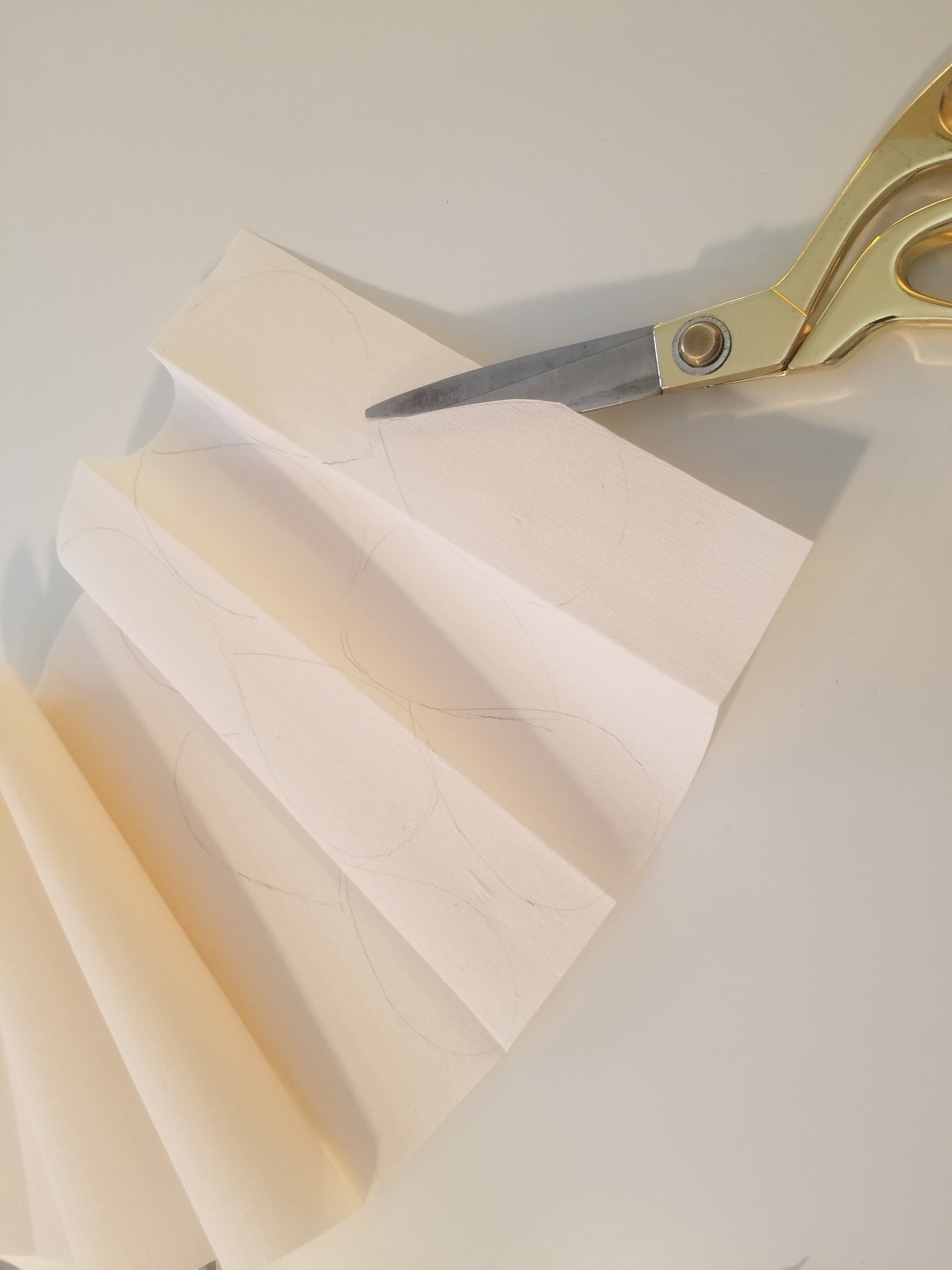
Fold the black crepe paper accordion style, and repeatedly cut 3/4 of the way through it, making some fringe.
Step Four
Start to glue the fringe around the ball so all the fringe is facing one direction. This will be the center of our flower.
Step Five
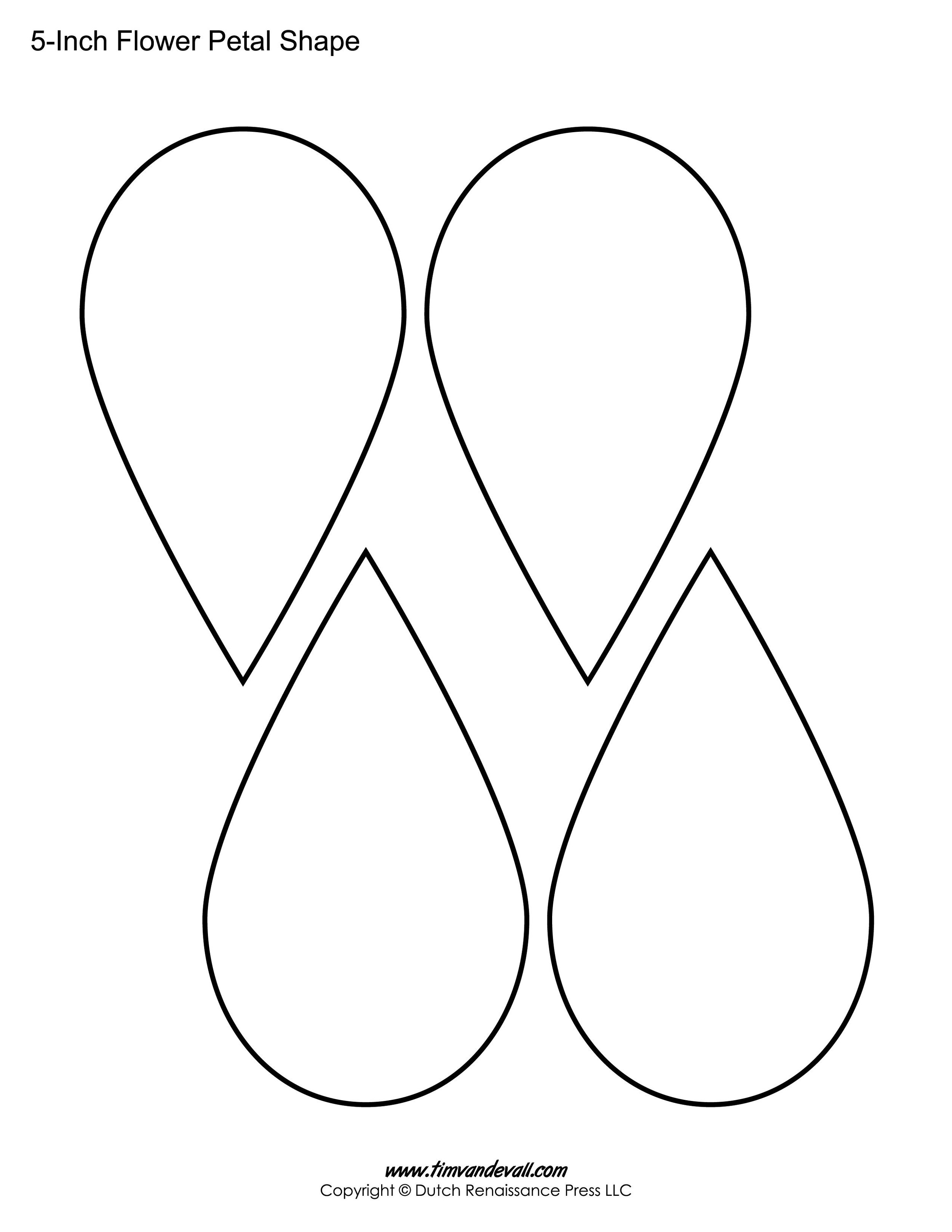
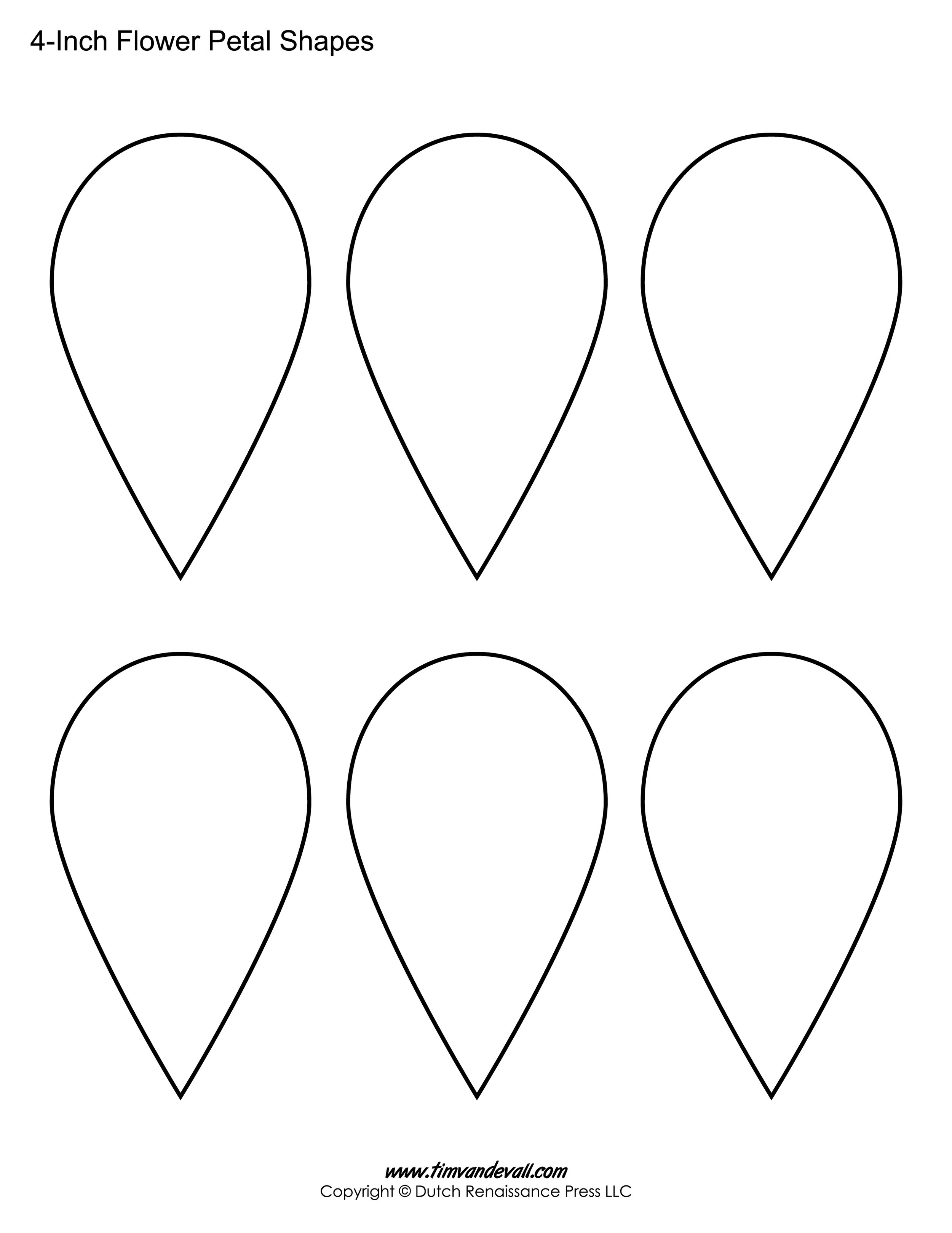
It’s stencil time! Below are some printouts of petals - but they don’t have to be identical. You’ll want 3 small, and 6 larger petals for each flower.
Step Six
Make sure when you cut out your petals that the lines in the crepe paper match up with the symmetry of the petal! This is an important step for later.
Step Seven
Petal to the metal! I found it was easiest to prop the pistil (fringe down) on top of a bottle to work and let it dry. First, you’ll want to glue the 3 small petals onto the pistil, equidistant from each other.
Step Eight
Let these petals dry - and if you’re doing more than one flower, repeat steps up to here on as many as you’d like.
Step Nine
Once the first 3 petals are dry, you’re going to glue the three larger ones in the spaces in between.
Rinse and repeat! Let those dry, and add your last three in between the spaces of the previous petals.
Step Ten
Now that everything is dry, take the tip of each petal and gently stretch the paper apart. The crepe paper is slightly elastic, so doing this will create a wavy edge to the flowers so they look more realistic.
Ta-Da!
Coupling these flowers with some floral covered books really finishes the look.
These flowers are great for the wintry spring that’s coming, adding romance to your Valentine’s Day, and sprinkling around your dining table for a lovely centerpiece.
One Room Challenge: Final Reveal-Fashionably Late, but oh so Fabulous!
It's here, the moment that has been on my mind for 6 weeks!! We have worked so hard on this studio space and now it will have it's debut. Let's revisit the start of this journey....
My son's old bedroom, you can hear me cringing...only 6 weeks ago!
Not exactly an inspiring space...but wait...
Do you remember the Mood/Inspiration Board?
Are you sitting down?? You are going to need to take a deep breath.
The new view!!
A cozy little nook, I had the green artwork previously in my dining room and it fits nicely in this space.
What's that fabulous mural? My daughter is an artist and came up with the design after we discussed the concept and she painted this beauty on my wall.
This mural symbolizes so much, if you look closely you can see the symbols incorporated by my daughter that directly relate to my life:
Koi fish with water-the water implies that the koi is swimming downstream, meaning that I have overcome obstacles.
Mountains on back of Koi with the sun rising-These are the mountains of Peru, where I have traveled and have a personal connection to them. They are also the symbol of abundance.
Feather on the spine-A personal connection with my father and his love of Eagles, we have shared memories between us that have created the backbone of who I am today.
Crossed Arrow-friendship, Circle with spokes on inside (Hogan)-Permanent home, Circle with spokes on outside-Happiness, Connected V's with smaller ones inside (Rattlesnake Jaw)-Strength, Thunderbird-Sacred Bearer of Happiness, Symbol for bird (two triangles, a curved line and a circle)-Carefree and Lighthearted, Two nested V's -Thunderbird tracks: Bright Prospects.
Such a beautiful and personal meaning for this mural. I think incorporating things like these in a space, adds a wonderful feeling that carries you throughout the day.
The green shelves are very useful lined up underneath the inspiration/cork board with lights. The board also hides the cords, because they are plug ins.
The lights were to be four, but unfortunately only three arrived and I'm still waiting on the Fourth. It ended up being fine, because with the placement of the mural, I only could really fit three across the inspiration board. Which by the way is just a piece of foam insulation (the kind you get at your local home improvement store) and fabric stapled on it with thumbtacks.
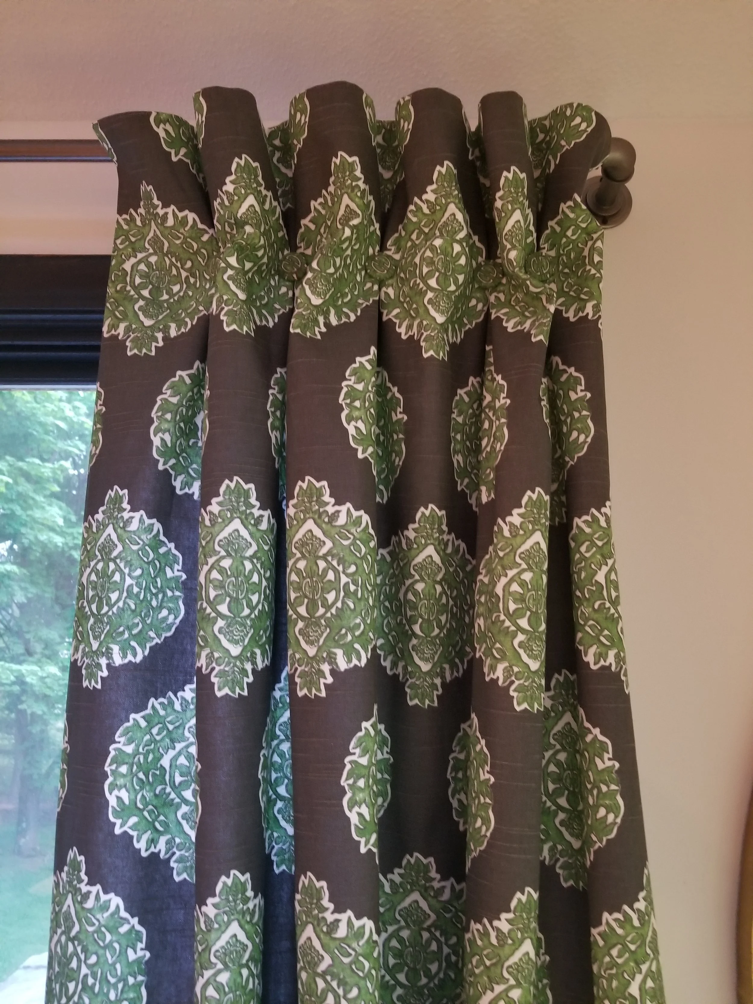
The curtain panels, turned out wonderfully with the help of my seamstress.
Another great place to sit and work in this space. I tried to create some seating areas to vary the view during the day.
The bookcases were given a coat of green lacquer paint, just like the low bookcases on the other side.
I'm really thrilled with how this space turned out!
Here's a quick recap of the work we did on this space:
~ Removed carpeting, painted floors and sealed with Poly
~ Painted: Walls, trim, bookcases, small pieces of furniture
~ Had window treatments and pillows made
~ Made Inspiration/MoodBoard
~ Added lighting around perimeter
~ Commissioned artist (daughter) to design and paint mural
Most of the items in this studio were orginal to my old work space. I reused mainly all my furniture. The only new purchases were the lighting, material for curtains, pillows and paint. All in all, it was more labor than money.
The work was heavy, the outcome was amazing and now I have a wonderful space to work in! Thanks so much to my husband, who without, I wouldn't have been able to complete this space, as well as my wonderful daughter, Madison, who really put some great personality into the studio with her custom mural! Thank you One Room Challenge and House Beautiful for this challenge that was truly a wonderful way to complete a space in my own home in 6 short weeks. Check out the other final reveals on the One Room Challenge Website.
XoXo,
Jenn
One Room Challenge - Week 5: Lessons I Learned and Why Coffee is my Best Friend
Should I tell you all the great things happening in the space? Or should I tell you about a couple of little setbacks? My husband always says to me, Do you want the good news or bad news first? Of course I reply: No bad news, all good please!! I'm going to start with the good:
The floors are painted! Hooray!
It created an optical illusion with the lines, kind of cool, looks rounded. I basically free formed this, letting it develop. This will serve as my 'area rug' for the work desk in this space. We will be polying the floor to protect all this work.
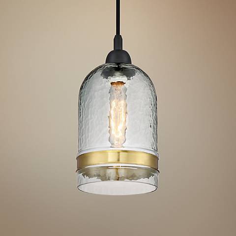
We hung the pendant in the space where the old 80's (some say retro) light fixture resided.
My Paris Loft vibe is showing through! I'm seeing this space as my haven and studio.
The previous low bookshelves that I put all my Fabric samples on got a major face lift! It went from drab gray to a really amazing green.
The before, they were ok...but needed some color.
Hello Gorgeous!!! I'm in love with this green color...Benjamin Moore Seaweed 2035-10 in a high gloss. Rawwwrrrrr!
So there is the good!!! Now for the frustrating not so good. I opened up my light fixtures and found that there were only 3, when there should be 4. The lesson to this story is: Always open up all boxes to inspect, so in this case it can be rectified immediately. I waited until yesterday...I know better! I do it for clients, but thought all was good for me. I called Lampsplus and they helped me immediately. Fingers crossed it will get here before the big reveal! I also ordered a pillow from Etsy that was to be an emerald green velvet(it actually came from Ireland!)....well since there are no samples it came and wasn't quite the right green. I may still use it. The swing arm lamps weren't the right gold, they were more of a brass..
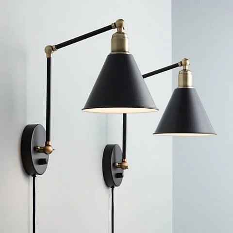
It might be hard to tell from this photo, but the swing arm lamps were more of a chartreuse like color and the pendant was more of a warm, gold color. So off they went to my spray booth (aka, backyard with cardboard).
Ahhh, much better! You'll see them in the space next week. They will be hanging above the Inspiration Boards that I'm creating.
So what's left? Inspiration Boards - I have an idea to use some foam insulation as the base....stay tuned.
Hanging of the Lights - With any luck, I will have 4!
Clear coat of the floor
Window Treatments!
Daybed area.....still working on that plan.
Paint the large bookcase backs with the green.
Drink large amounts of coffee...better yet, IV stat!!
Follow along with the other One Room Challenge Participants! We are closing in on this challenge and I'm looking forward to seeing the Final Reveals!! (Including my own...)
xoxo,
Jenn
One Room Challenge - Week 4: Straight Lines and Crossed Eyes
I totally thought I was 20 something when I started this challenge. I mean, I was just celebrating my 21st Birth.. no nevermind. I'm 40 something. This week was an obvious reminder that I should scale back on physical labor or resign to hiring out.
So what did I get done this week? Some floors. Ok, ok, you're disappointed!! I know, I am too. My big public project is now complete and I have caught up with my clients. So the next few weeks should prove fruitful.
I taped until I couldn't tape anymore. The border and the interior border are now done...hmmmm, looking sparse in the center, but I will be adding some design in the center this week. I promise.
I'm really digging the border around the room, highlighting the nook. I'm ready to play basketball, where's my hoop?
It makes some really beat floors look a little more put together!
I'm thinking of putting the little day bed in the nook, it will fit nicely. Maybe build a small platform with bun feet and some decorative trim?
The bookcases deserve this look, don't you agree?
I also will be adding lighting, possibly painting the doors black and painting the low bookcases and interior of the big bookcases with the spectacular green color. I really can't wait..........to go to bed!
Head over to the One Room Challenge page and cheer on the other participants!
xoxo,
Jenn
One Room Challenge - Week 3: The Big Cram
Okay week 3, you kicked my butt. Work has me crazy and leaves little time for anything other than sleeping and eating! I felt like I was in school again and crammed for the exam the night before....
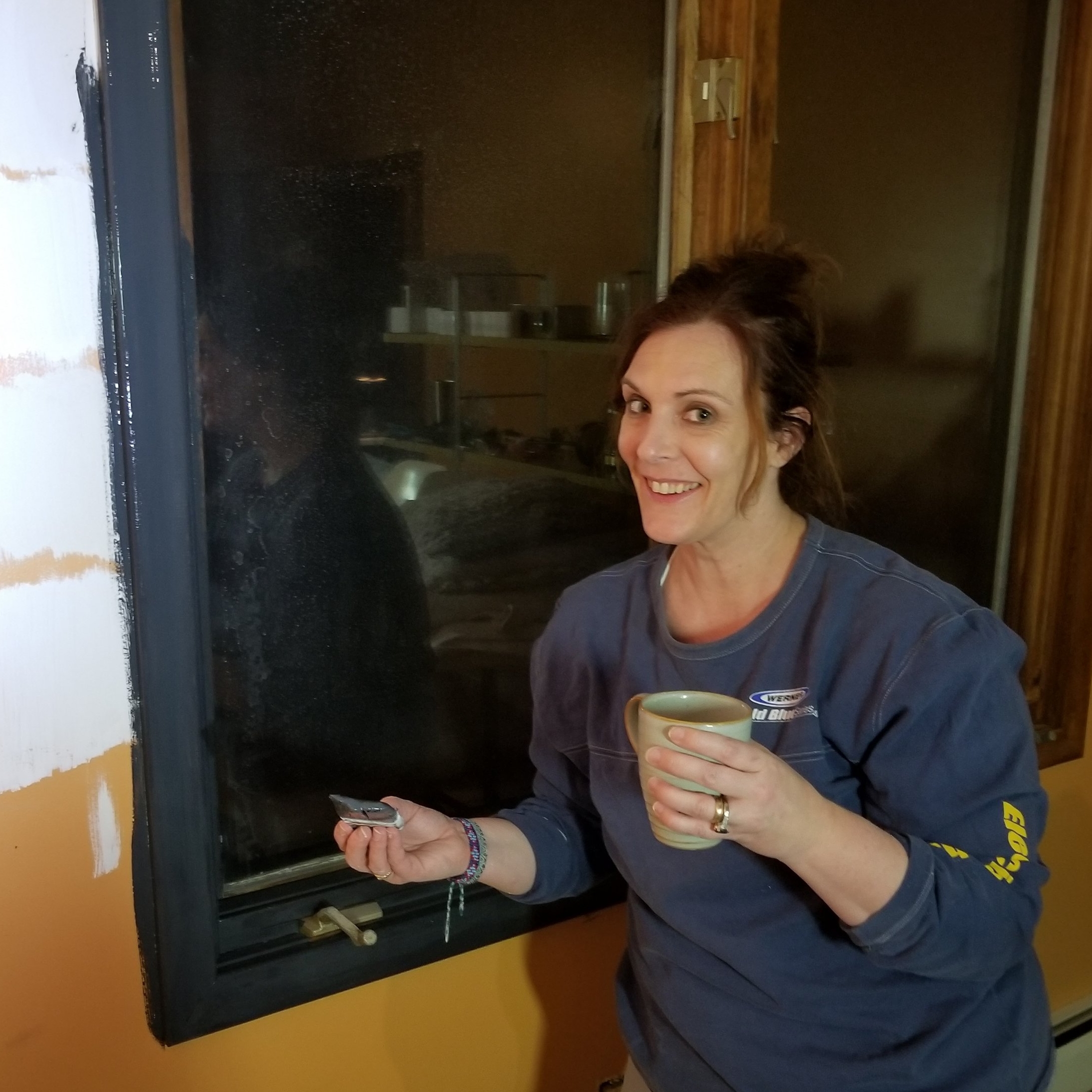
Hey now, that's me, cramming in my painting on a Wednesday night at 9 pm...coffee in hand! I didn't put that paint brush down until 1:00 am ish.
I wasn't alone, I had my trusty handyman aka husband helping me out. I'm so glad he agreed to this late night painting party. Some couples have date nights that involve a wonderful dinner and drinks. But we have something special...
She's fresh, fresh, exciting...My walls and trim have arrived! They are walking in the room with popped collars.
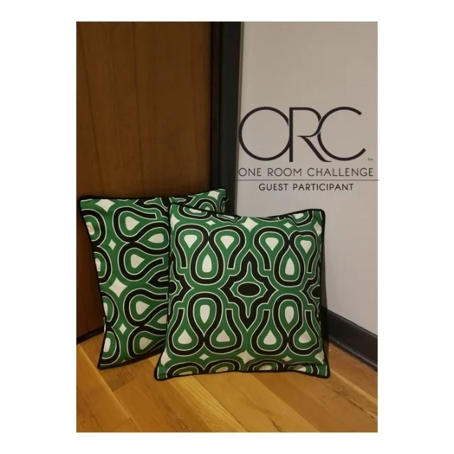
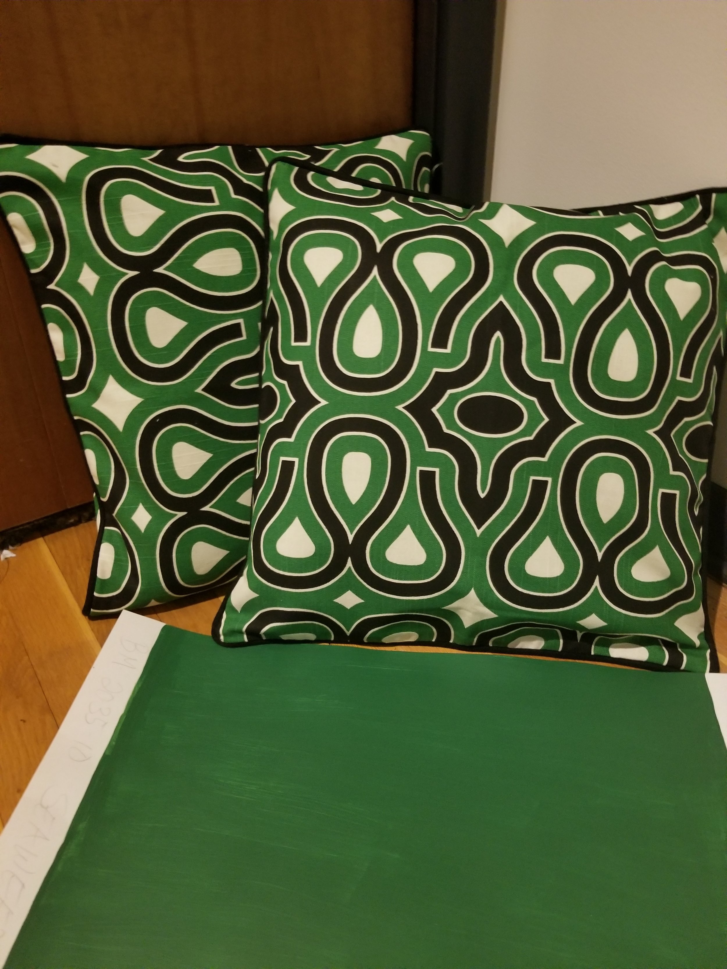
The room now has a great feeling, It's much like a loft now. We still have some touch ups, but I'm very pleased with the initial results. I need to decide on the doors, should they stay the wood color or be painted black? The lighting is in, the pillow cases are in and I have decided on the seaweed green as it goes nicely with the pillows.
This speaks to me, it says, Jennifer....you're on the right track.
About the lighting, it's beautiful, but I think i may paint the brass on the wall lamps more of a gold so it matches the hanging pendant. The floor hasn't been touched but will be a chevron pattern. I need to decide on the width of the lines and would like to put a chunky border around the room. So what's in store for next week?
1) Painting/modifying the swing arm lamps
2) Taping the floor off and painting
3) Designing a little nook for the cushions
4) Sourcing cork boards for the wall under the swing arm lamps
Follow along with me and the other participants. We are starting to show amazing progress!
XoXo,
Jennifer
One Room Challenge: Week 2 - Congratulations, It's A Hardwood Floor!
Here we are, week 2. I'm happy that there is progress, as in bye bye black carpet!
That's my willing victim...I mean husband, helping me tear up the carpet.
Not the most flattering picture of our newly revealed hardwood floors, but, I'm beginning to get a little giddy at the prospect of the possibilities!
After 3 hours of hard labor, we have hardwood floors!! A little scratched, beaten and bruised, no fault of our own, it is now all ours. I've assessed the situation...not too bad, and no time to refinish or desire to do so.
So my options are to paint all or paint a little? Below are ideas for the floor finish/style.
Image via Pinterest
Image via Pinterest
Go all in, or half way? I'm still deciding and will reveal the outcome next week.
Next Decision: Wall color and trim...
And don't you say you don't see the difference in the white/off white colors! Undertones, people...
I tried 4 white/off white colors in the space and monitored it in the light during the day they were from the top:
1) Benjamin Moore-Decorator's White OC-149
2) Benjamin Moore-Chantilly Lace OC-65
3) Benjamin Moore-Cloud Cover OC-25
4) Benjamin Moore-Super White OC-152
I made my decision quickly and swiftly, I'm in love in with #3, Cloud Cover. It's the right tone, day and night. The slight tan undertone keeps it warm and not stark. I picked 2 blacks, both from Benjamin Moore, Black Beauty 2128-10 and Soot 2129-20. I picked the Soot as it had some blue in it that made it more vibrant and paired nicely with Cloud Cover. The wild card is the green, I have several to choose from....waiting on the pillow covers to determine the final call. But, I'm really liking Seaweed from Benjamin Moore 2035-10.
I'm feeling a little pumpkin vibe right now....the favored green is on the right next to the wall color and trim choice.
Lighting is up next, the space has no overhead lights and needs a creative solution that doesn't require hardwiring. I found some pretty awesome arm wall sconces from Lampsplus . As well as a cool industrial chic pendant and artwork lights.
Ok, so we are cooking!! What's in store for next week? Paint!! I'm painting the walls, floors, ceiling, and anything that doesn't move (beware sleeping dog or husband).
Be sure to check out the other participants and guest bloggers at One Room Challenge!
Until we meet again,
xoxo Jenn
One Room Challenge: Week 1 - The Studio Transformation
Hello everyone, I'm writing you this from my very space that will be transformed with a final reveal May 10th for the One Room Challenge. You're probably wondering what I'm talking about, The One Room Challenge is something that Linda Weinstein from Calling It Home created years ago and has gained so much traction in the Design blogging world that it is sponsored by House Beautiful. It happens twice a year, in the fall and the spring. 20 invited design bloggers transform a room and blog about it for 6 weeks for a final reveal at that time. Pretty challenging and exciting all at once! There are also guest participants, enter me! My first time designing a room on a tight timeline in my own home for all the world to see....my space-The Studio.
My current studio view..I really wish that was wine, nope, it's ginger-ale.
The space that I'm redoing is my son's old room, yes the one that I let him pick the colors at the ripe age of 12. So, forgive the choices, and the Halloween esque vibe. There is a lot to do in here before I can deem it my official work studio. I'm moving on up(stairs)...cue music, my previous work space was the beautiful sun room right off our dining area. Although I love it, I need more elbow room to meet with more than one person. I'm embarrassingly attaching more pictures of the current situation. This is in hopes I will knock your socks off in the final reveal.
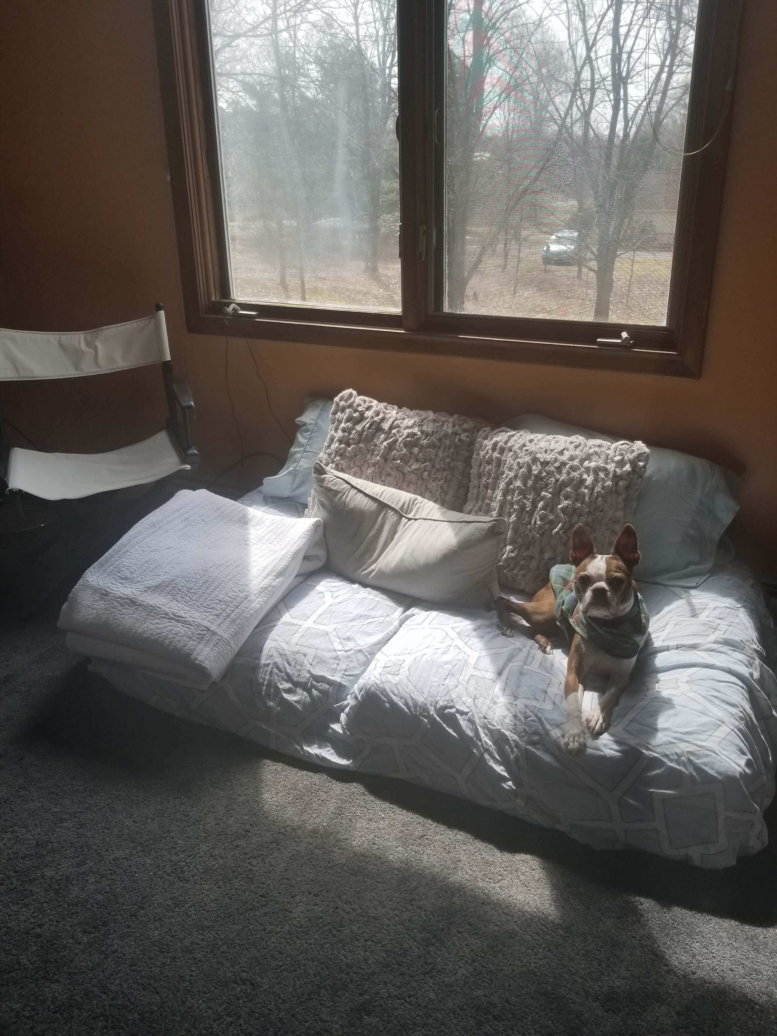
Hmm....my dog always steals the show, the best thing in the picture now. A little hint on the final reveal with a makeshift daybed.
Should I add another?? Are you looking away in horror?
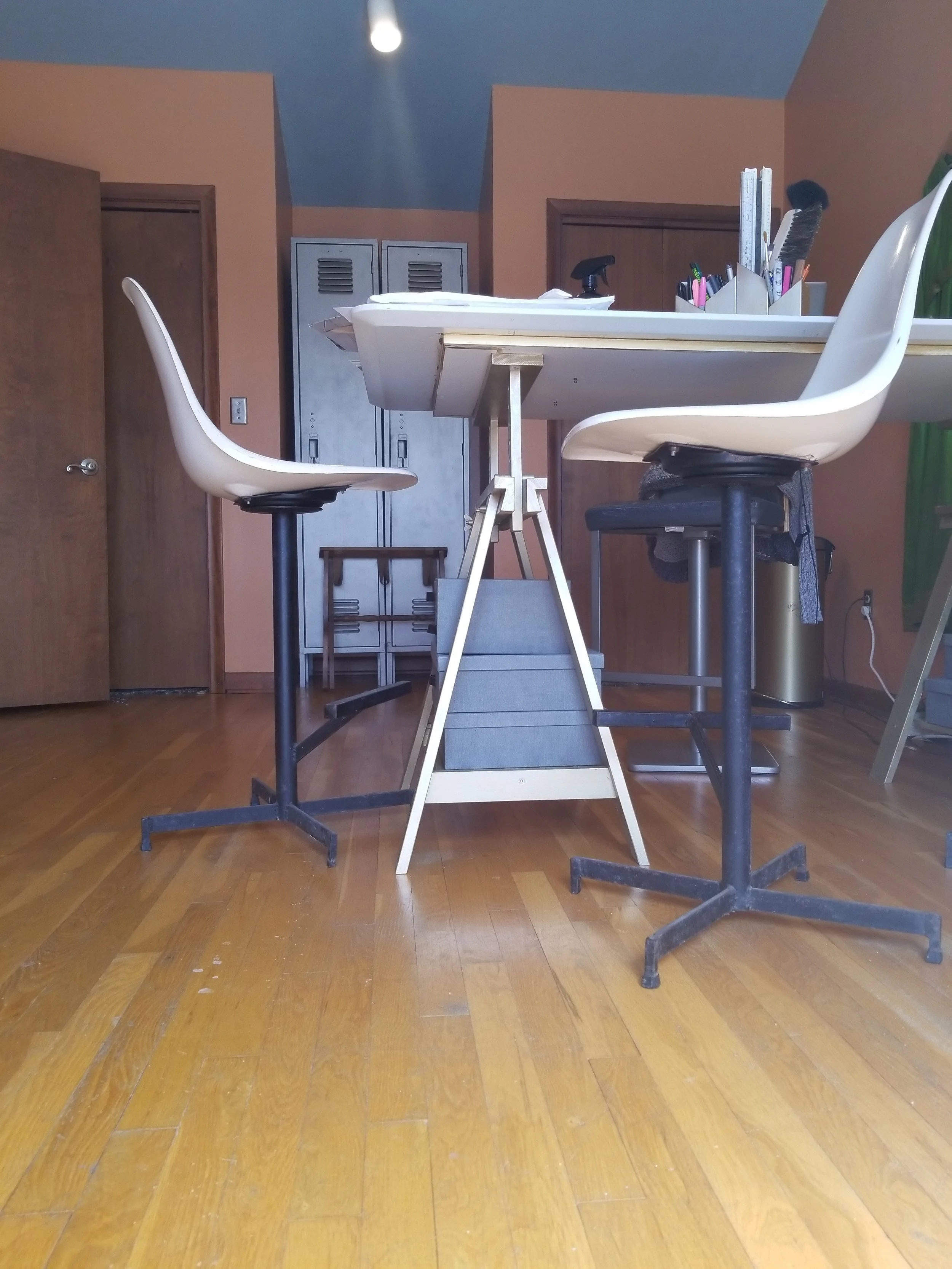
I really don't know if I'm keeping the lockers...they are pretty cool (You're thinking-Yes, for a school.) Ok, I'll consider removing them.
Just when you thought it was safe to look again.....
I think I'm done torturing you, let's do this!
Ok, now you've seen my deepest darkest designer secret....and you're still here reading, whew!! It's time to change this space, I have big plans my friends.
This is what I want to do:
1) Paint, paint and paint some more!! Walls, window frames...maybe even floor.
2) Create a wall with inspiration boards.
3) A mural...perhaps? No, not an uncool birds and butterflies, but a chic, sleek, fashion forward, graphic one.
4) A station to collaborate and design or meet.
5) A daybed area to accommodate an occasional overnight guest (mainly my daughter).
6) An area to photograph product.
These are my main goals, my inspiration or vibe is contained in the moodboard that follows:
I'm completely struck by the idea of an invigorating office/work area. So I've added emerald green to black and white and it suits me just fine.
The main design style is an upbeat, Parisian loft influenced studio. I have a love affair with the color green, particularly emerald green. I'm undecided on pattern on floor, if any...may just paint that a solid color. Like any design project, once I start,things evolve. Follow along and see where this goes!
Please take the time to support the other design bloggers who are participating in this event, it's quite the undertaking and I'm happy to be in company to these talented designers. Check my blog next week to see progress!!
xoxo,
Jenn
The Art of Picture Hanging and How to Break the Rules
Why is it that hanging a picture gives us pause? Putting a hole in your newly painted living room wall seems so permanent…and destructive. Let me show you how to hang a picture properly for your space and in certain occasions break the rules.
Let’s start with the simple concept of negative and positive space. The negative is all the wall, the positive is everything else that takes it up. For example the positive are objects you hang, architectural features and pictures. Below is an example of a wall with negative and positive space.
Photo by Phil Crozier
Interior Design by Erica Coo
Pretty simple when you look at it that way? But wait there is more. Not only do you have to balance the spaces, but you have to make sure they are spaced properly and in scale. Spacing doesn’t have hard rules, but in my professional opinion, 2” is a good spacer between artwork and objects on a wall. You can break the rules and have more space in between, but that would apply if you’re trying to fill the space with art. The example that follows is one, it wouldn’t look as good to have these grouped closer. They also have more impact individually.
Image courtesy of Studio McGee
Scale…..no, not the one in your bathroom. It can be a hard concept to understand, for example what if you go shopping and want to buy a dress. The dress is so beautiful you have to have it, but wait it’s not in your size. So, you wouldn’t buy it, why? because it wouldn’t fit your frame. It’s the same concept, you wouldn’t buy a teeny tiny piece of artwork for a large wall would you? Unless you are grouping it with other artwork, it wouldn’t make sense. How do you know it’s the right size? Well, I can tell you, it just will look right. But, that doesn’t help when you are ordering or purchasing remotely. Here’s a trick to remember, grab some butcher or newspaper and make a life size template of the dimensions. Hang it on the wall. How much space is around it? By keeping a border on the sides of 1/4 the width of the piece it will be a good balance. Would it look better with a companion? This can be answered by following the previous rule of having the border on the sides.
Image from Apartment Apothecary
Oh that’s great you say, but how high should the artwork be?? Standard is 57” on center. So that means that smack dab in the middle of your artwork it should measure 57” from the floor. This is museum standard and deemed the perfect height for viewing artwork. Another standard is eye level. Now this is very tricky. I once had a client that was very tall and he hung the artwork at eye level….see where I’m going? There’s also the standard of if you’re hanging artwork in a room such as your dining room you want to enjoy it while sitting down and keep it at eye level seated. Confusing? I can see your head spinning.
The most important thing is to keep a balanced wall, if you’re grouping of course not all the art is going to be eye level, 57” on center or eye level when seated. So, break those rules. I’ve seen artwork hung low, I mean really low that you could kick it. Does that mean it’s wrong? No, not if it’s a whole group that is balanced. Like this bathroom. It keeps it interesting when you are ummm….predisposed and there are no magazines.
Ok, so yes you know where to put the artwork, but how do you hang it? Remember the paper template?, after it’s centered and leveled and in the right area, measure how far down the hook is located. Mark that area and nail or screw right through the template. Rip the template off and hang. This is not fail proof. Sometimes measurements can be off, don’t be discouraged (see #5). If you are hanging a grouping, use that level!
Here’s a recap of rules to break:
1) 2” between pictures..unless the artwork can fill the space and is interesting.
2) One quarter the width of the artwork for a border of wall on each side.
3) Groupings can extend all the way down, usually these are seen in bathrooms.
4) Picture height, 57” on center, eye level and eye level seated. Or throw it out the window and keep it grouped and maintain a border (see #2).
5) Don’t be afraid to make holes in your wall, that’s why we have spackle.
6) Use a template before you hang, if you’re feeling adventurous…eyeball it (see #5).
Happy Picture hanging!! I would be more than happy to answer your questions in the comments, or show me your successes! And remember there is always spackle.
Now go do it,
Why you should 'Fall' for changing your decor
Jewel tones and metallics give a rich and cozy feel to your rooms for the Fall season. You need not use the typical fall colors, because it's all about warmth, texture and bold choices. Velvet and mohair impart the warmth and texture nicely. While the jewel tones of the blue and burnt orange bring vibrancy.
Ever see a room and just feel instantly cozy, refreshed, calm or renewed? Or smell a scent that gives you comfort? These are the elements of design that add up to an environment that embraces the seasons. ' Embraces the seasons?'- You say...what does that mean? Every season has a feel and smell,and capturing that in your home can elevate your experience. I personally get giddy when it comes time to change my home's seasonal decor. It means there is a new beginning of sorts and an opportunity to change the atmosphere.
I'm not talking large elements, things like pillows, throws, small accessories and candles are all that's needed. Since Fall is here, we will focus on that...
How cozy does this mood board feel to you?
Elements don't need to be the typical colors, match your existing decor with richer jewel tones
If you already have these bold colors in place, then bravo!! You can put your seasonal spin on things by adding some soft texture and metallics.
Seasons are often associated with colors, I want you to step back and look at it as a feeling instead. Fall evokes, cozy, warmth, texture, and deep rich colors in my mind. Matching existing decor shouldn't be a problem, stay within that color family and punch it up a bit. In the example above, I've used deep navy blue, burnt orange and gold. I could see purple, fuschia and gold as well being used for a more feminine vibe.
Here are some Fall decorating elements to remember:
1) Texture-Mohair, faux fur/fur and velvet are cozy and inviting textures that evoke warmth for the upcoming cooler months.
2) Jewel Tones-Deeper, richer tones are enveloping and can harmonize with your existing decor. This is a play from the outside, where the leaves and flowers are deeper in color.
3) Metallics-An indirect interpretation of the golds, browns and oranges found in the leaves. It gives some sense of sophistication and warmth.
4) Scents-Candles, potpourri and stove top creations are wonderful accents. It lends a hand in creating the perfect atmosphere of comfort and sometimes nostalgia.
If you happen to be in the part of the country where the season doesn't change, then having some of these rotating elements can help evoke the mood of Fall. Living in New England, I love the Fall, it gives me respite from the dry hot season and allows me to unwind and almost hibernate. My tastes change too in the kitchen, soups, breads and savory dishes take charge. I'm ready to put on a sweater, my long boots and grab a cup of pumpkin spice latte and sit on my deck, who wants to join me?
